Here’s what you’ll find in this blog:
- What are the Major Attribution Models?
- What is Attribution Reporting?
- How to Generate Attribution Reports in Google Analytics?
- How to Gain Insights from Google Analytics Multi-Channel Funnel Reports?
- Closer Look at Google Analytics Assisted Conversions
- Understanding Top Conversion Paths in Google Analytics
Google Analytics is useful for a lot of things, but is it good for attribution modeling? The practice of allocating marketing budgets to maximize ROI across different channels sure sounds like it’s right up Google’s alley. But the benefit of attribution modeling can only truly be realized if it’s reported effectively.
Fortunately, Google Analytics has one of the most sophisticated attribution reporting methods available today. The key to successful attribution lies in being able to generate and read these reports. The attribution reports in Google Analytics show business exactly where they need to focus on increasing conversions and improving ROI.
Today, we’ll take you on a quick tour of the attribution modeling in Google Analytics and how you can get the most out of it for your business. But first, let’s take a quick glimpse at some of the significant attribution models.
What are the Major Attribution Models?
Not all marketing attribution takes place on a uniform pattern. Instead, there are several attribution models that businesses use to decide how to allocate marketing budgets. The most commonly used models are:
1. First Touch Attribution
This model predicts that the first point of contact with the user is responsible for the conversion. That’s why 100% of the conversion credit goes to the first point of interaction or first touch with the user. For instance, a user sees a Google Display Ad and decides to visit the site, several interactions later. According to this model, the display ad gets all the credit for the conversion.
2. Last Touch Attribution
The last model assigns the credit to the first interaction, but this model gives credit to the last interaction. Suppose the user in the above example entered the brand’s name into a search engine and visited the site. According to this model, the last direct search query gets all the credit for the conversion.
3. Linear Attribution
The linear model maintains a balance among all the channels and assigns equal credit to each channel in the conversion. So if a user interacts with four separate channels, the linear model gives 25% credit to each channel.
4. Time Decay Attribution
The time decay model pegs the most recent channel as the most significant one. So the last channel the user interacts with before visiting the website gets assigned the most credit. Every preceding channel gets assigned progressively lower credit.
There’s no ‘one size fits all’ solution when it comes to attribution modeling. Every business has to decide which model it must follow according to its unique factors. However, the reporting of the chosen model matters immensely when it comes to implementing changes.
What is Attribution Reporting?
Attribution reporting is simply a close look at the journey users follow once they contact the brand. There’s plenty of ways to report this user journey, but visual representations always help. Graphs, charts, and diagrams make it easier to understand where the process works and where it lacks.
The attribution report in Google Analytics is multi-faceted and diverse in terms of the information it presents. As we shall discuss below, the report provides graphical and statistical information regarding each channel’s performance. But first, let’s look at how to generate the report using Universal Google Analytics.
How to Generate Attribution Reports in Google Analytics?
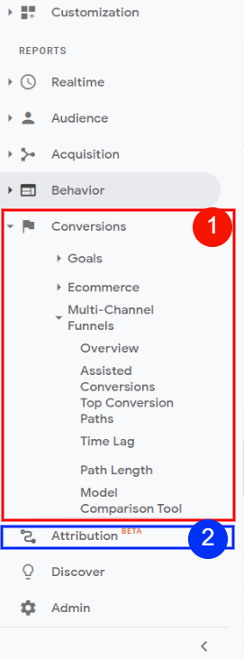
Once you open your Google Analytics account, you’ll see a menu on the left-hand side such as the one displayed below. There are two ways to access attribution reporting through Google Analytics. The first is by clicking on the ‘Conversions’ tab and then the ‘Multi-channel funnels.’ This will display a wide array of options below. Each of these options will provide a unique look at the marketing attribution of your business.

The second method is by clicking the ‘Attribution‘ tab. The main difference between the first and second methods is the nature of the information. While the ‘Multi-channel funnel‘ option depicts the user behavior across channels and channel conversion paths, the ‘Attribution‘ option shows each channel’s value. We’ll be sticking to the explanation of the multi-channel funnel in this blog.
How to Gain Insights from Google Analytics Multi-Channel Funnel Reports?
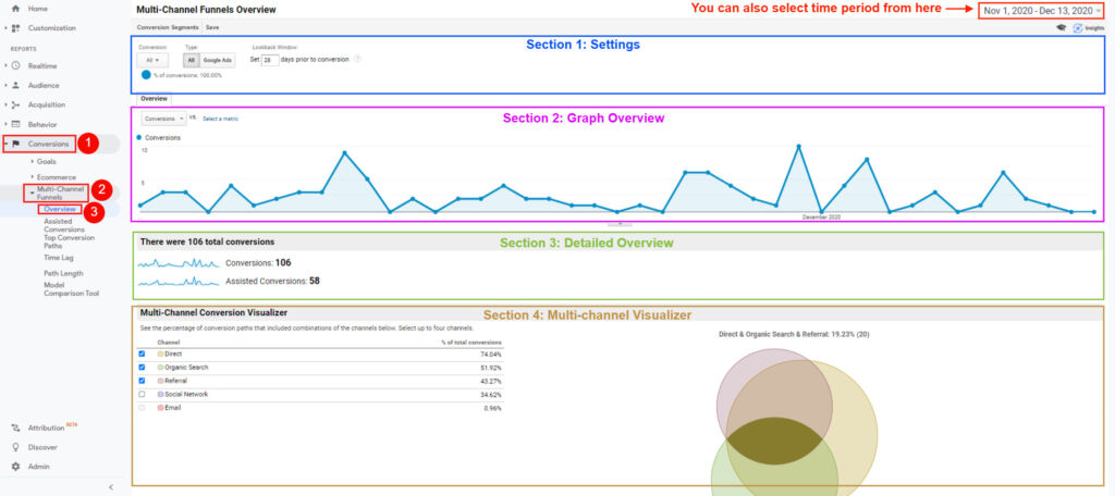
First things first, opening the multi-channel funnel reports.
- 1 : Click on ‘conversions’ in the menu on the left hand side.
- 2: Select ‘Multi-channel funnel’
- 3: Choose ‘Overview’ from this menu.
Now you’ll see a screen like the one displayed below. There are four sections on this screen.
Section 1: Settings
The first section, settings, displays three main options.
- The first option is conversions which allows you to select the conversion for analysis. The more goals you have in GA, the more conversions will be available for selection. But it’s always a good idea to focus on one conversion at a time to get accurate results.
- The second option is type which allows you to select between All conversions and Google Ads. This option is useful if you only want to analyze Google Ads campaigns performance.
The third option is a lookback window. This option allows you to choose the time duration over which you want to see conversion performance. But you can also select a custom time range from the box in the top right corner.
Section 2: Graph Overview
This section is the graphical representation of the type of conversion selected in section 1, over the chosen time period.
Section 3: Detailed Overview
This section shows the particular type of conversions selected in section 1 over the chosen period. The first number indicates the total number of conversions, while the second number shows the assisted conversions.
Assisted conversions are conversions that are assisted by other channels such as social and referral etc. In case you have Google Ads integrated with Google Analytics, you’ll see two further options under assisted conversions. These options will be:
- Rich Media Assisted Conversions: These conversions are those in which users view rich media, such as video content, on the Google Ads platform during conversion.
- Impression Assisted Conversions: These are the conversions in which users have at least one impression of the ad along the conversion path.
If you have Google Ads integrated, then the assisted conversions are broken down into the two categories above. Otherwise, only two numbers are displayed as in the image below.
Section 4: Multi-channel Visualizer
This is the final section of the multi-channel funnel overview. The multi-channel visualizer shows the contribution of each channel in overall conversions. There are two parts to this visualizer:
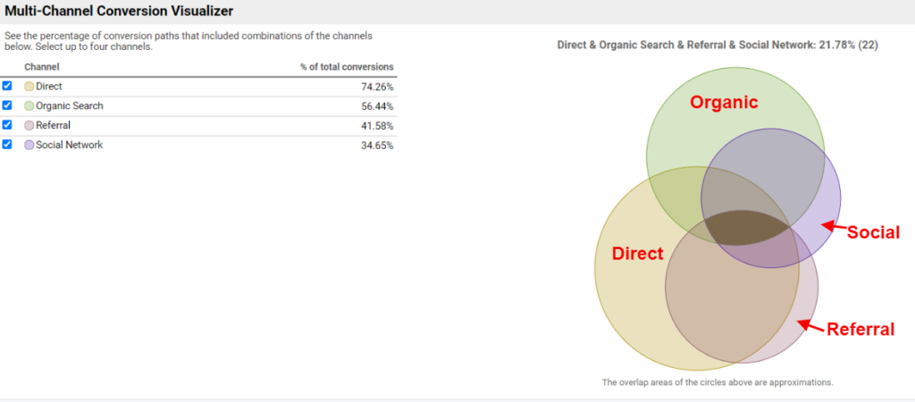
- The table on the left shows the percentage contribution of each channel to overall conversions.
- The Venn diagram on the right shows the overlap between the channel contributions. This diagram is an easy way to assess the relative importance of each channel in overall conversions.

Here’s a closer look at the multi-channel conversion visualizer. There’s a particular color assigned to each channel. This color-coding helps identify the overall contribution of each channel to the assisted conversions.
The table on the left presents this contribution in percentage terms. For example, direct channels have the most significant contribution of 74.26%. This is also shown by the largest orb representing direct channels.

The overlaps are the areas to focus on. These overlaps show that there is synergy to be explored. For example, the overlap between organic and direct channels shows that if we were to increase SEM and paid advertising, there would be a greater number of assisted conversions.
Wanna know how you can do more with Google Analytics? Check out its Lifetime Value Reports!
Closer Look at Google Analytics Assisted Conversions
Now let’s take a closer look at assisted conversions. From the left-hand menu, click on ‘Assisted Conversions’ under the ‘Multi-channel funnel’ option. A screen like the one below should open up.
The first two sections, settings and graphical representation are similar to the ones we discussed before. The settings section provides the same three options of conversions, type, and lookback window. The graphic representation section shows the number over the selected time.
The third section, which is data representation, shows a plethora of data. The top strip shows the number and value of assisted conversions. It also shows the relative percentage of assisted conversions compared to the total number of conversions. The ‘last click or direct conversions’ are simply the types of conversions selected for this model.

The data table at the bottom depicts the contribution of each channel in the assisted conversions. But the problem with this table is that it doesn’t show the consumer journey. So even though you know the number of conversions by channel, you don’t know how the users ended up there. For that, we turn to the ‘Top Conversion Paths’.

Understanding Top Conversion Paths in Google Analytics
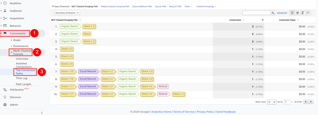
Select the ‘Top Conversion Paths’ from the menu on the left hand side. The following screen would appear.

You’ll notice that the most popular paths are shown here. This path depiction is beneficial for one special reason. These paths show the exact consumer journey for users as they got to the website. As such, you can adjust your attribution strategy according to the top conversion paths. Since marketing attribution is all about improving channel conversions, this analysis reveals which channel has the most conversion potential.
So that’s all there is to it. You’ve got your attribution reports, and it’s time to adjust strategy to account for the best performing channels. Good luck!
[hubspot portal=”6539536″ id=”0216077c-fa40-4ee1-b68e-2ed513ba8e02″ type=”form”]

